Friday, May 6, 2011

Pencil Sketch

When we bought our first house, my inlaws had a beautiful pencil sketch of it done for us to frame and hang. It was one of my favorite pieces (still is) but we have since moved and the man who did the sketch is no longer doing them, I didn't think I'd ever have one of our current home...until now.

Matt's cousin Caleb shared a tutorial with me that creates a pencil sketch from a photo. I think you can really play around with the oppacity and intensity, but here is where I am so far...
here is a link to the tutorial Caleb sent me...Thanks Caleb!
http://ooglewindowblinds.com/photoshop-tutorials/photoshop-create-sketch-effect

Wednesday, May 4, 2011

Tutorial: Selective Coloring

As with many of "tutorials", this one is more of an illustration on an action set than a real lesson.
1. Open PSE and the picture you wish to work with.
2. Run the action set, "selective color" {from The Coffeeshop} by double clicking the thumbnail. YOu will be given a screen to tweak and adjust the intensity of the black and white levels. Once pleased, click OK and your photo will now be a Black and White one.
3. You will now have a black and white picture and your cursor will be a brush tip. Click over any area that you wish to color. You can change the intensity of the color by adjusting the opacity (higher opacity = stronger color).

Friday, April 29, 2011

Tutorial: Textures

This is such a simple thing to do with your pictures that you really don't need a tutorial, but I'll show you very quickly how to use them.

1. Open PSE and a picture that you would like to work with.
 2. Open a texture (my favorites are from Rita of The Coffee Shop). This one is called favorite apron. Textures are jpg files, so you are actually just layering two "photos" on top of each other.
 3. Pull the texture onto your picture. At this point, it covers up your photo to the point where you cannot see it. Go over to the layers and adjust the opacity of the texture layer to your liking.
 4. I settled on 45% and flattened my image.


Thursday, April 28, 2011

Great Find: Collages and the Group it action

Collages not only look great but break up blog posts that are "picture heavy".  I have made them before with different programs, but wasn't happy with my results in PSE. Here is one I made earlier today (before I learned about the Group it action). It isn't horrible, but the division between pictures isn't unified and the design looks messy (some boxes have the white borders, others do not). I knew there was an easier way out there...leave it to Rita from The Coffee Shop to have an action devoted to collages!. 
 Here is a collage that I made with the Group it action. SO SIMPLE! Want me to show you really quickly? 
1. Open PSE and the template for the collage that you would like to use. I found some great ones at Florabella (you can download for free if you "like" her on Facebook) and June Lily.
 2. Double click the group it action. It will open a dialogue box prompting you to choose your first photo. It will put each photo in its own layer.
3. What is nice about this action in the ability to move your pictures between the layers. Below you can see the shot of Emma Kate is larger than the slot allowed width wise, but perfect height wise. Size the picture to your liking using the corners and hit the green check. You can see that Emma Kate is overlapping the other boxes...don't worry...

4. Double click the group it action again and repeat step 3 for each slot in your collage.


 5. Once they are all inserted, you can play with the layers and arrange them (send back, bring forward, resize a bit) by just double clicking the layers. Make sure they make it to the dotted lines or an overlapping photo will be seen. When you are finished, flatten your image and save. If you flatten and save and see overlapping or an error, it's ok...undo the flattening and fix it, reflatten, and save. Voila!

Tuesday, April 26, 2011

Tutorial: Removing unwanted objects with the clone tool

In a hurry to try to grab my kids in a picture, I often get other people, the camera strap, or my own fingers in the shot. Using the clone tool you can easily remedy this. Here is a shot of Sam and some unidentified objects in the foreground (my fingers?).

Let's remove them...
1. Open PSE and a picture you want to work with.
2. Click on the clone tool (its the one that looks like a rubber stamp). Hit the "option" button (the alt key if you are not a mac user) and click an area near your mistake that is close to what you want to paint over your mistake with (did that make sense?). You are basically copying an area and will repaint over your mistake with this. At first, set your opacity to 100%.
do you see the plus sign above? that is where I made my clone stamp and am painting over the fingers...you can already seem them disappear.

3. Once they are gone, you may want to adjust a bit. Sometimes it looks a little obvious where you have done some altering. Change your opacity to a lower number (somewhere between 25% and 45 % seems to work well for me) and paint over the area a little bit more. It should help it to blend in much better.
4. Now you can go about your editing business...I am using the action set by Coffeeshop called Lustrous Pop and I will sharpen his eyes a bit.

Can you believe how easy that was?

Friday, April 22, 2011

Tutorial: Making the eyes stand out

As the biased mother that I am, I think my kiddos have amazing eyes. Because I am not a professional photographer, have kids who are moving targets, and can't always shoot when the lighting is ideal, my pictures can use a little help. In this picture Emma, although adorable, doesn't have eyes that look as luminous as they do in real life. I figured out a few tricks to make her eyes really pop...here goes...

1. Open PSE and the file you wish to work with.
2. Zoom in on your eyes and using the magnetic lasso tool, outline the iris on one of your eyes. 

3. Change the "feather" amount to 10 px (feathering is what blurs what you work with with what you leave alone so it isn't quite so obvious. or at least that is my understanding of what feathering does). Then go to {enhance -> unsharp mask} and change your radius to 3.7, keep your threshold at 0, and play with the "amount" lever. Closer to 100 works best. If you set your amount too high it doesn't look natural.
4. At this point, you can leave it alone and you'll have added some sparkle to your eyes. You can also adjust the contrast a little bit to make them stand out a bit. I am going to opt to deepen the blue tone in this picture because they are a little muddy and don't show as vibrantly as they do in real life. With the iris still selected, go to {enhance -> adjust color -> color variations}.
then click shadows -> increase blue and lighten as well as highlights, increase blue, and lighten. Look at those eyes! That is how they look in real life! You can apply this same series of moves for other eye colors as well. 

subdtle, natural, easy...the eyes have it.
p.s. do you know how to take a screen shot? on a mac, it is command+shift+3

Thursday, April 21, 2011

Tutorial: Silhouettes

I have wanted to make sihouettes of the children for a long time now. There is a lady who makes them every year at the State Fair, but at almost twenty dollars a piece, I've never pulled the trigger on getting them made...and now, I won't have to. It is incredibly easy (we're talking a twenty minute project here) to make your own.

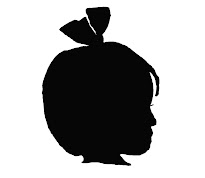
1. Take a profile shot of your adorable subject. This might be the hardest part of the whole project. If at all prossible, take it in front of a light background. Here is the picture I am using:
2. Open Photoshop Elements and the picture you are working with.
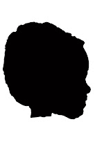
3. Using the magnetic lasso (which is the third tool down on the right hand side of your tool box), very carefully trace your cutie pie. Go very slowly. Once you go around the neck and head, your shape will blink. If your shape doesn't and you are leaving a trail, you have an opening in your shape...try again.

4. Delete this section. It will now be a white hole. In the color boxes (bottom left of the screen), choose what color you want to fill in with. Black is the classic silhouette color, but I've seen a lot of bright colors lately.  Grab the paint bucket and pour into your white space.

5. Copy your shape. Create a new blank file {file -> new -> blank file} and paste your silhouette onto this new page.
6. Sam's silhouette was a little bit angled, so I grabbed the shape and custom rotated it so that it was straight. You can now crop so that there isn't as much "white space" as well as change the color of the background if you want. Easy, right?

*at this stage you can also use your eraser tool on a very small setting to smooth some of your edges. If you see Sam's below, you can see some areas near his nose, chin, and forehead that could benefit from a little edge softening. I'll post another shot once I work on that.

Tutorial: Graphics Frames

 I am the last person who should be giving a tutorial, but I have to share with you how simple it is to make a graphic into a picture frame, which can then be used a blog header, button, or just to dress up your posts.
Here are my step-by-step directions and screen shots (they were made on a Mac, but nothing I am doing here is mac specific):

1. Find a graphic you love (the Internet is filled with free ones) and download it. The one I am using is from dry icons.
2. Open photoshop elements and the graphic you just downloaded.
3. Go to the bottom right under your layers. Click your layer and name it. See "lock" and a picture of a checkerboard? Click the checkerboard. Now, use the "quick selection tool" to highlight an area that you want to remove. I have better luck using a very small brush size.
4. Cut this portion {edit > cut}. You should now see the gray and white checkerboard pattern indicating that this layer has a "hole" in it.
5. Open a picture that you wish to use (edit it to your liking first).
6. Drag picture to the checkboard
7. Resize it to fit your frame.
  8. Send it to the back {layer > arrange > send back}.
  9. Flatten image
10. Add text if you like and flatten again (if you don't flatten the image when you are finished, you won't be able to save it as a jpeg file).

there are probably many ways to accomplish this for a project and they may in fact work better, quicker, and easier...but this is they way that I happen to know, so I use it. Let me know if it works for you (or if it doesn't!).

Action Sets

I will start this post off by saying that I know little to nothing about Photoshop Elements. I downloaded the free trial a few weeks ago and immediately knew that I wasn't quite smart enough to figure it all out. It took a lot of reading up, online tutorials, and The Pioneer Woman (yes, she even figures into the equation outside of the kitchen...told you I LOVE her). Fast forward a few weeks and I have figured out a few things, found some really cool places for help, and don't feel quite so illiterate about the program.

In Photoshop Elements, you use layers to change, sharpen, and bring out colors. Action sets create and adjust these layers for you automatically. That is especially helpful in the beginning while you are learning (and by you, I mean me). Here is an original, straight-out-of-camera shot and the picture when action sets have been applied to it.


The action sets are fun and really help if you have a half-decent picture but terrible lighting. I've also removed scratches and bruises from faces, juice box squirts from tee-shirts, and ice cream from chins. 

Two great resources for action sets are The Coffee Shop Blog and The Pioneer WomanI think the best instructions in how to install these come from Rita at The Coffee Shop Blog. 

All fonts used in the pictures come from Amanda. There are literally hundreds of fonts on her sites and they install very easily (click them once downloaded and they install themselves). 

Oh, one more thing...everything I've mentioned here is F-R-E-E!